Swarm UI: A New Interface Paradigm for Talking to Agent Collectives
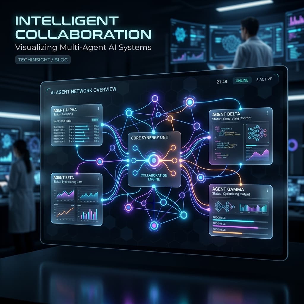
Beyond the Chat Window: The Agent Cockpit
As multi-agent systems become the default way software gets built, the familiar conversational chat interface has hit its ceiling. A new category is taking over: dashboard-style, mission-control interfaces we're calling Agentic UI. The core requirement is simple to state and hard to build — every agent's task progress and every message it exchanges with other agents needs to be visible, in real time, without drowning the human operator in noise.
This article is about the interface layer specifically. If you want the architecture — how agents divide roles, sequence dependencies, and check each other's work — that's swarm intelligence and agent collectives. If you want the business model, that's the rise of AI agent marketplaces. What follows assumes the swarm works and asks the harder product question: what does a human look at, and when do they get to intervene?
Why Chat Breaks at Three Agents
Chat is a beautiful interface for one agent and an actively harmful one for several. The reason is structural, not cosmetic: a chat log is a single ordered sequence, and a swarm is a set of concurrent processes. The moment three agents work in parallel, their messages interleave into an order that reflects nothing about causality. You read that a QA agent found a failing test, scroll past two unrelated status updates from a different workstream, and hit the backend agent's message that caused it — thirty lines later, with no visual link between the two.
Worse, chat has no concept of current state. A conversation is a history; an operator needs to answer "what is true right now" — what's blocked, what's waiting on me, what's already committed. Reconstructing that by reading upward through a transcript is exactly the work an interface should be doing for you.
What a Good Agentic UI Actually Shows
- A live task graph: which subtasks are done, in progress, blocked, or waiting on human approval
- A searchable transcript: every message agents exchanged with each other, filterable by agent and by time
- Confidence and risk flags: which decisions the swarm made autonomously versus which ones it escalated
- One-click rollback points: a clear checkpoint to revert to if a downstream agent built on a bad decision
Notably, Cursor 3.11, released July 10, 2026, shipped exactly this kind of feature for developers: a searchable archive of past agent transcripts alongside a dedicated side chat, so a team can inspect precisely what an agent did during a specific run rather than trusting a black box after the fact. Cursor also shipped an iOS beta in the same release, which is a quiet acknowledgment that approving agent work is a distinct activity from producing it — and one that doesn't need a keyboard. We trace that arc in more detail in Cursor 1.0 and what came after.
The Five Hard Problems
Every serious Agentic UI is a set of answers to the same five design problems. Naming them separately helps, because teams routinely solve one well and assume they've solved the others.
1. Observability: design for three altitudes
The instinct is to stream everything. That produces a firehose nobody reads. The pattern that holds up is three fixed altitudes with a clear way to move between them: a fleet view answering "is anything wrong anywhere" in one glance; a run view showing one task's graph with per-node status; and a step view exposing the raw reasoning, tool calls, and outputs for a single action. Most operator time should be spent at the fleet level. If your users live in the step view, your fleet view isn't trustworthy yet, and no amount of polish on the step view will fix that.
2. Intervention: let people steer without stopping
Most agent UIs offer two controls: start and kill. That false binary pushes operators toward killing runs they could have rescued. A usable set looks more like four: approve or edit the plan before execution begins (by far the cheapest place to correct a misunderstanding); inject a mid-run correction the agent picks up at its next step boundary; veto a single step without discarding completed work; and only then, abort. The middle two are what teams skip, and they're what makes long runs tolerable — an operator who can nudge lets a run continue; one who can only kill, kills.
3. Trust calibration: show evidence, not scores
A numeric confidence percentage next to an agent's action is one of the most seductive bad ideas in this space. Operators either learn to ignore it or, worse, learn to trust it — and self-reported confidence correlates poorly with correctness, particularly on the subtle failures that matter most. What calibrates trust properly is evidence: which tests the agent ran and what they returned, which files it read, what it explicitly did not change. "Ran 48 tests, all passing, did not modify schema" earns appropriate trust; "94% confident" earns misplaced trust. The slower-burning mechanism is track record surfaced per task type, which lets an operator calibrate on history without any explicit score.
4. Failure representation: the silent kind is the dangerous kind
Agent failures come in three flavors and interfaces almost always design for only the first. Loud failures — the agent errored, the run stopped — are easy: show the error and the step. Stalls are harder: the agent is technically running but has spent six minutes retrying variations of the same failing approach. That needs loop detection plus a nudge, because a spinner looks identical whether progress is happening or not. Silent wrongness is the one that costs money: the run completed, reported success, produced something incorrect. No status indicator catches this, so the interface's job is to make verification cheap in place — the diff, the test output, the query result, the rendered screenshot. If reviewing an agent's work requires leaving your interface, silent wrongness reaches production regularly.
5. Approval flows: gate on reversibility, not importance
Teams instinctively gate on how "important" an action seems, which produces approval fatigue on trivia and blind spots on genuine hazards. The better axis is blast radius and reversibility. Reading a file is free. Writing to a branch is trivially revertible. Merging is revertible with effort. Sending an email, charging a card, deleting a bucket, or messaging a customer is not revertible at all — and irreversible actions should be default-deny with an explicit human approval, no matter how confident the agent is or how routine the task looks.
Two details decide whether an approval queue actually works. Batch related approvals so an operator makes one decision about a coherent change rather than eleven decisions about its parts. And define explicitly what happens when nobody answers: an approval request that silently expires into "denied" after a timeout is safe but produces mysterious half-finished runs, while one that expires into "approved" is a security hole with a UI in front of it. Pick deliberately, and tell the operator which one you picked.
The Attention Budget Problem
There's a timescale mismatch most designs ignore. Agent runs take minutes to hours; humans don't watch a screen for an hour. Yet most agent interfaces are built as a page you're expected to sit on, which guarantees one of two bad outcomes: the operator babysits and the automation saves nothing, or they walk away and miss the one moment they were needed.
The interface metaphor that fits the timescale isn't a dashboard you monitor — it's an inbox you're pulled back to. That means the notification design is the product design, and it needs to distinguish three cases: "I'm blocked and need you now," "I finished, review when convenient," and "here's routine progress you should never be interrupted for." Get those three wrong and everything else about the interface is irrelevant, because the operator will mute it. This is the same discipline good issue trackers apply to notifications — the way Linear keeps its notification surface deliberately narrow is a better reference point for agent UI than most AI products are. Our look at Linear's method covers why that restraint works.
Design as Orchestration, Not Decoration
The frontend designer's job has quietly changed: less about making an attractive button, more about acting as traffic controller for data from several AI systems at once, deciding what a human needs to see versus what stays logged until it's needed. Layered translucent panels are genuinely useful here rather than merely fashionable, since they let a dashboard stack simultaneous activity without every layer fighting for full attention — but the load-bearing skill is information hierarchy, not visual style. Our best AI design tools roundup helps with the surface; the hierarchy is still yours.
A Concrete Layout Pattern
| Panel | Purpose | Update Frequency |
|---|---|---|
| Task graph (center) | Overall progress at a glance | Real-time |
| Agent transcript (side) | Deep-dive into one agent's reasoning | On demand / searchable |
| Approval queue (top) | Actions waiting on human sign-off | Real-time, high priority |
| Risk/anomaly feed (bottom) | Flags on low-confidence or unusual decisions | Event-driven |
Anti-Patterns to Avoid
- The fancier chat log. Dumping every agent message into one scrolling feed and calling it a dashboard. Fine for a two-agent demo, unusable at ten.
- Over-animation. Constant motion photographs well and actively degrades an operator's ability to spot the one anomaly among a dozen routine changes. Calm by default; visually loud only when a human is genuinely needed.
- Fake progress. A percentage bar for a process whose remaining steps are unknown teaches operators to distrust every indicator you show them. Show the completed step count and the current action instead.
- Anthropomorphizing. Cute names and avatars feel friendly and make failures harder to reason about — operators start attributing intent instead of reading logs. Name agents by role.
- Hiding cost. Tokens and compute consumed belong on the run view. Operators can't make sensible autonomy decisions without knowing what a retry costs.
A Checklist Before You Ship
Five questions that expose the gaps. Can an operator answer "is anything wrong right now" in under three seconds without scrolling? Can they correct a misunderstanding without killing the run? Can they verify output without leaving the interface? Is every irreversible action default-deny with defined timeout behavior? Is a rollback point one click away? A "no" is a fixable design gap, not a model limitation.
Where This Goes Next
Expect these dashboards to keep converging with the observability tooling that already exists for distributed systems — the instincts that built tracing and alerting for microservices are now pointed at swarms of agents instead of swarms of services. The teams that get this right treat their agent fleet the way a site-reliability team treats production infrastructure: instrumented, alertable, and always one click from a rollback. That framing also increasingly applies to the environments agents run in, which we cover in the next step for cloud development environments.
A Note on Trust
The core tension is easy to get wrong: showing too little makes operators nervous and pushes them to micromanage every decision, which defeats the automation, while showing too much creates alert fatigue and gets muted. Interfaces that survive default to a summarized view with drill-down on demand — trust the swarm by default, but make it trivially easy to go deep the moment something looks off. That balance now determines whether an agent product gets adopted more than the underlying model's capability does, which is a genuinely new situation for design to be in.
Frequently asked questions
Why doesn't a chat interface work for multi-agent systems?
Because chat is a single ordered sequence and a swarm is a set of concurrent processes. Once three agents work in parallel their messages interleave in an order that reflects nothing about causality, so a failing test and the change that caused it can end up thirty lines apart with no visual link. Chat also has no concept of current state — it's a history, while an operator needs to know what's blocked, what's waiting on them, and what has already been committed right now.
Should an agent UI show confidence scores?
Generally no. A model's self-reported confidence correlates poorly with correctness, especially on the subtle failures that matter most, so operators either learn to ignore the number or — worse — learn to trust it. Show evidence instead: which tests the agent ran and what they returned, which files it read, what it explicitly did not change. "Ran 48 tests, all passing, did not modify schema" calibrates trust properly; "94% confident" does not.
Which agent actions should require human approval?
Gate on reversibility and blast radius rather than on how important an action seems. Reading a file is free, writing to a branch is trivially revertible, merging is revertible with effort — but sending an email, charging a card, deleting storage, or messaging a customer is not reversible at all, and those should be default-deny with explicit human approval regardless of how routine the task looks. Also define what happens on timeout: expiring into "denied" is safe but produces half-finished runs, while expiring into "approved" is a security hole with a UI in front of it.
How do you design for agent failures?
Design for three distinct kinds. Loud failures (the agent errored and stopped) just need the error and the step surfaced. Stalls — where the agent is technically running but has been retrying the same failing approach for minutes — need loop detection and a nudge, because a spinner looks identical whether progress is happening or not. Silent wrongness, where the run reports success but produced something incorrect, is the expensive one, and no status indicator catches it. The only defense is making verification cheap in-place: show the diff, the test output, the query result, the screenshot.
Should an agent dashboard be something you watch or something that notifies you?
Something that notifies you. Agent runs take minutes to hours and humans don't watch screens for hours, so a page designed to be monitored produces either babysitting (which saves nothing) or an operator who walks away and misses the one moment they were needed. The metaphor that fits is an inbox you get pulled back into, which makes notification design the core product design — and it must distinguish "blocked, need you now" from "finished, review when convenient" from routine progress that should never interrupt anyone.